Wednesday, 11 April 2012

Evaluation Question 4

This maybe a typical reader for my magazine that I have created. A profile of this person, they might spend their spare time talking to friends or on the internet, watching the tele or even listening to music. They may send there money on shopping online or spending there money on buying CD's. They would have creative skill and would be able to have a good laugh with. Shops they would go to maybe places like HMV or River Island. They would listen to a range of music because it depends on the person and what they like, but they would like the most popular music type from when they were growing up, because it is what they would of listened to. They would like to watch such films as rom-coms or just comedy may be a horror now and again. They might like programs such as sitcoms and American TV.
They may want to buy my magazine I created because it bright and colourful and sends out a good message, because the cover person looks natural and just like a person you would see down the street. Plus the magazine in my opinion gives out a young vibe about it.

Evaluation Question 2

Although the images are from different parts of a magazine, they have similarities. A similarity with these images is that the body language from both people, they are both on a bit of a slant away from the camera. The smile of both people is quite similar too. They both have a slight smile at the corner of the mouth. The gesture of the 2 people is also similar, they both seem to be acting casual, the clothes are also very casual, nothing big and bright like other magazines. Although this may sound boring, it does stand out from the bright colours on the magazine. Another similarity between both of the photos is that both the make up and hair are natural,  many people like natural it gives out a good message to people.
There are some differences with these images as well, the lighting is different but also a bit similar, the light on both images seems to be more on the face th

Evalution question 3


Magazine profile- Published by BBC Magazines, first published in feburary 1995
Other magazines they own:
Adult

[edit] Teen

[edit] Pre-teen

[edit] Educational

[edit] Pre-school

Information from http://en.wikipedia.org/wiki/BBC_Magazines
It is similar because it focuses on more mainstream ideas and uses the same colours as the one I created, the colours pink, blue and white are used in this front cover. The layout is different and more professional looking then mine this may be because it contains more pictures then mine. All together though they both hae the same age range and the same genre of music that it contains.

Looking at the genres that this publishing company spreads itself over the genres and age range, but this publisher only has 1 music magazine that it publishes which is a pop magazine which means another publisher would have to publish my magazine because there would be competition between my magazine and there own magazine and a company wants a wide range of an audience.

Evaluation Question 7


Image 1- Music magazine
Image 2-College magazine (preliminary task)

When doing the premliminary task and the final product i lent that using and adding as mc technology as you can to a magazine is not easy, especially when using new programmes. I also found that when doing a magazine you don't just need the perfect image on the front cover or through the whole product you also need the pefect layout and colour pallet. Many people like buying a magazine not just for the person on the front cover but also for the colours used and how it stands out from the magazine industry. Comparing the two magazines I can see that the 2 have similar colour pallets and both have a similar layout, but the difference between the 2 would be that the final product has a better image than the preliminary task, this maybe because I switched technology when taking the photograph, although it isn' t the best image it is still better then the other one. Also the final product is brighter then the preliminary task this maybe because of the programme I used, for the preliminary task I used Publisher and for the final product I used Photoshop.

Evalution Question 6

Here are some software, hardware and websites I used when doing my final product.

Publisher- I used this when doing my preliminary task, but I also used this when putting photos on my magazine. It may have just to put an effect on it or just to make it brighter
 Word- I used this when writing up my story for the double page spread, this was because I needed to check for spelling mistakes
 PowerPoint- I used this when creating special effects on text, I didn't use this programme much because most of the things I needed for my magazine was on Photoshop.
 Hardware (camera)- This is the first camera I used when taking my front cover image.
 Hardware(laptop)- I used this when doing work for my magazine when I was in the house, I downloaded Photoshop of the internet while making changes to my magazine or adjusting photos, I also used computers in the college to do my magazine.
 Hardware(camera)-This is the second camera I used when taking my final photo for the front cover and for the photos inside
 Blogger- This is where I put most of my work on including photos that I could of used for my magazine. I also could look at other peoples blogs using this website.
 Google- I used google when doing research on certain magazines and also when finding blogger
 Windows Photo gallery- I used this when adjusting my photos
 Photoshop- I used this when actually doing my magazine, this included my layout, text and colours

 Hardware(camera/phone)- I used this to take photos but also to keep in touch with people who I was taking photos of incase I lost the photos and needed some new ones

Hardware(iPod with camera)- I used this to take photos on the go when I wasn't carrying my camera about with me

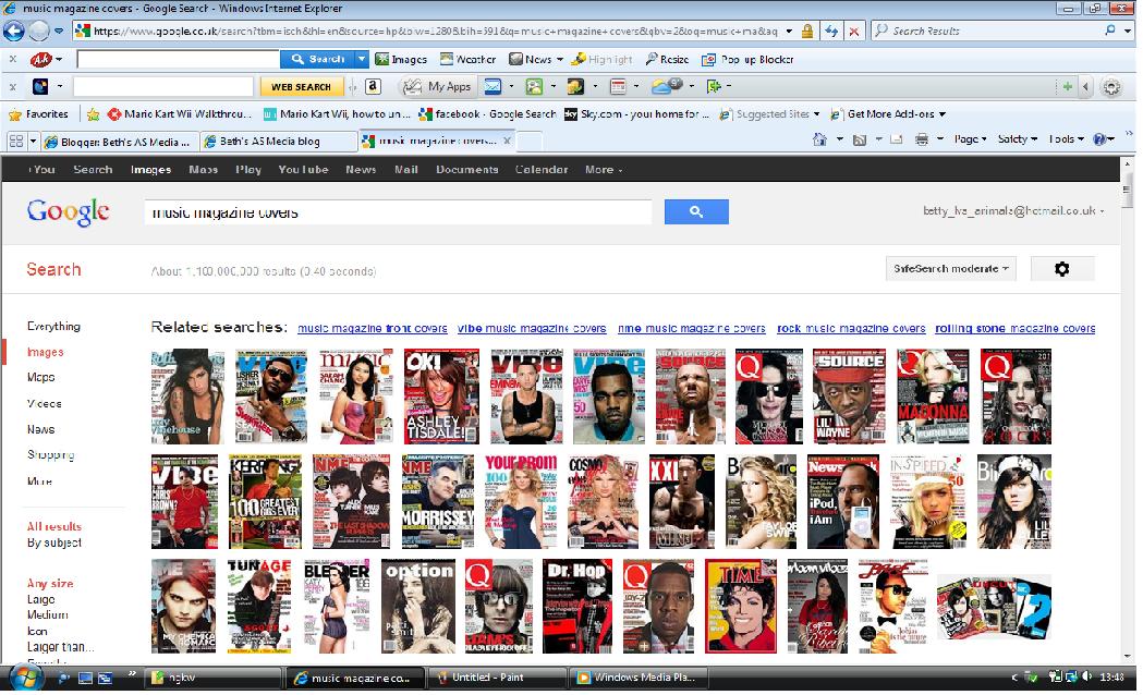
Google Images- I used this website when looking for research or searching for inspiration for my magazine

Evaluating the amount of technologies I used I would say that I used too much hardware technology and not enough website technology. I learnt when doing this that you can't always expect all technology to do it for you because sometimes can not always be reliable.

Evaluation Question 1

Evaluation Question 5


Sunday, 30 October 2011

Flat plan for music magazine double page spread


Flat plan for music magazine double page spread


Rationale:

On my double page spread the image will be a middle close up so you can see the chest upwards, the image will cover one page with the article title over the image, when doing some research on double page spreads it seemed that the image and what people were wearing in the image had to link in with whole article, so the colours in the image also needed to be the same as the colours of the article e.g. the text. The kicker will introduce the story so will go at the top because most music magazines have it above the story. The content of the text will be in two columns because in my opinion I find it easier to reaad it that way. Another image will go under one of the columns to show it is part of the story. In the story I will not jut start with questions I will do a introduction type of thing first then go into question, I will also include pull quotes because are also very popular with music magazines and gets readers intrested when its what the people are saying. The colours I may use are gold, silver, black and white, I think that colours are nice colours plus it links in with the colours on my front cover, I will use gold and silver as a highlighting device for important parts of the article e.g.pull quotes. I will use a sharp sort of font this in my opinion catches the readers eye more just for the title and kicker, for the rest of the text I will use an easy to read font, the article title will also be in capital letters to make it more bold, to begin the story I will use a drop

Images


Inspirational Double page spreads


This double page spread article is very effective as it has basic colours which makes it stand out, the magazine writer highlights things with  the colour red against the black and white it stands out so this is a good way to show something important e.g. a celebrities name. The thing that would draw the reader in would be the article title as it is very large and has basic colours, the font of this sharp and large, it is also in capital letters, plus with the black boxes behind the writing at different sizes it is almost like the letters have been cut out of different magazines or newpapers. The article title is also pull quotes which would attract the readers more because it comes from the person who the double page spread is about. There is only one image which is the main image, it is large and covers more than one page of the double page spread but it is very effective becuase the red on what the main person wearing is also a highlighting the person just like how writer who highlighted the important words that readers would catch one and read because it is important to the story, so maybe what the main person in the image is wearing links in with the article not just because its about them but also becuase the whole article was meant to consist of basic colours e.g. red, white and black. The layout of the article is simple especially since the content of the text is very small and only takes up a small amount of the double page spread, but the article title and the main image take up the most of the layout of the page,  the content of the writing part of the article is just spilt into 4 columns which means there isn't much writing. This double page spread only has a short kicker which I think is better because it brings the reader into the story so I would say the shorter it is the more the reader would want to read it. I think double page spread is very effective as it uses basic colours and has a very unique article title. Also what I would take out of this double page spread to put into mine, would be a short yet effective kicker as it will make the reader want to read the rest of the story, also make sure that these colours would also link in with the image as it would be very weird if it didn't link in, it would look out of place. In conclusion I think that this double page spread would catch the readers eye with its big and unique article title,  its simple colours and the main image being across a whole one page. Plus this one doesn't just go into question its a straight forward article.


This double page spread is effective and would attract a reader because the colours are very royal. This is because when you think of gold or silver you immediatly think of jewellery or money so thats why I would say the colours are royal. So these colours would be considered important which means the story is important. The image is also very effective because it shows four people but it only highlights one by mking the others a bit more faded so the person stands out, plus going back to the colours, the main person in the image is dressed fully in gold which also shows that this person is important. This image of the people also just like the other one also carries over the other page. The layout of the double page spread is also very simple but very different to the other double page spread, just like the other one though it has a small amount of writing for the article. This double page spread also has a pull quote which is highlighted with a black box around the words/lines. Just like the other one it also has a big article title which is also in full capital letters, apart from the picture you would moostly look at the article title. Unlike the other one its kicker (itroduction to the story) is a lot larger and in my opinion a bit hard to read. The layout is different to the other one because the other double page spread goes horizontal but this one is verticle. This one also has a sharp font for the article title and the kicker but both this magazine and the other magazine have the same font for the text of the article. I think that this magazine is very effective because of its colours, the colours gives the article a tone of great importance, the story may not be that impotant but the colours show the readers that it might be important but you have read the article to decide for yourself, the image is also powerful just like the other one the image links in with the article because of the colour. I like the way that one person is highlighted and the others are faded it is a great way of catching the readers attention. The only thing that I would change about this double page spread is that you can't really see the kicker. What I take out of this double page spread would be the colours or the picture because it is a very effective way to bring in the reader. Also unlike the other one this one just goes straight to the questions when the one is a straight forwar article.


This double page spread is very effective as just like the other 2 double page spreads has a large photo which cover one page and a little over the other one. It also uses basic colours but unlike the other 2 has more colours although how basic they are. The main colours (red, white and black) is also so like double page spread one which this means that these colours are very popular wtih music mgazines and maybe other magazine double page spreads. The content of the text about the same as the others as it looks it is a bigger font size, the font itself is different to the others because the others are sharp and bold this one is more curved and includes a drop cap which the other double page spreads do not include. The layout of the double page spread is similar to the first one but the columns are in two and not in fours, which means it looks it has less more writing but they are similar because it is just of half. The image is also in the same place and the tet is in the same place, also the article title just the other one carries onto the other page. The kicker is a lot larger though, not as much as the second one so I would say that this one has just amount of text for the kicker. This one also has a highlighting device but this one has it for highlighting the words that is not in the article or is about the article like the two. This mght mean that the double page spread is a specific part in the magazine. The image also relates to the article because of what the person is wearing not as much as the other two but it does because the person is wearing black and silver and black is a main colour in the article. This one does not include pull qutes like the other two but like the second double page spread the article includes questions and is not a straight forward article about the person the artilce is about. I think that this double page is effective because just like the first double page spread includes basic colours  andd is very similar to the first one. The thing that I will take out this double page spread is the layout becuase this is what I think is the most effective about this double spread it is very simple and you see this one in magazines then the other two.


This double page spread is effective because the colours are so simple this is what makes it effective. Just like the other 3 double page spreads the image carries onto the other page and covers one page but this one only links in with the second one because the article title does not carry over to the other page. The article title is not like the other ones because it is not all in capital letters. I additition the font type, the only way to describe it is mostly straight but some bits are highlighted with italic writing and with a different colours this might mean it is important to article e.g. the persons name is in a blue. Like the first one the kicker is very small,even smaller then the first one. Like the first 2 this one has pull quotes but is smaller then the other 2. The layout is similar to the first and the third double page spread becuase the image and the title is in the same place. But is more similar to the third one because the text content is in the same layout (2 columns). It also is like the third one because it has drop caps which highlights sentences. Like the first one it is just a straight forword article because it includes no questions. But in my opinion this one has more of a text content. The colours a s said before a very straight forward, you would normailly see this thing not in a music magazine but in a celebrity or lifestyle magazine. What I would take from this maga zine is that the layout, because it seems very popular with music magazines.

Friday, 7 October 2011

Audience Questionnaire

Please Fill out the questionnaire below, we need this information to help us have an idea on our audience type:
These questions will give us an idea on what audience we are looking at:
1.        What age group are you?(Please circle the answer)
        13 and under    14-20 years     21-30 years    31+
2.       What gender are you?(please circle the answer)

Male         Female
3.       Which social class group would you put yourself in?

Upper class               Middle class              Working class          Unemployed
These questions will give us an idea on what the target audience would like a music magazine:
4.       What genre(s) of music do you like?(you may circle more than one)

Pop         Rock    R n B     Hip Hop       Rave        Dance        Heavy Metal    Classical    Indie 
Any music genre not included that you may like please write below:


5.       What music magazines do you like to look at?


Why?


6.       What’s more important to you in a music magazine or any magazine in general?

The stories and celebrities         the magazine layout and colour
If none of the above please write what you think?


7.       Finally, what would you like to see in a music magazine?


Thank you so much for your time, Hope you have a good day !!.

Monday, 3 October 2011

More Pictures For Magazines !!


These photos may need to be improved but these are first drafts so will be improved these were took by me, on my CD's

Friday, 30 September 2011

3 orignal images


This is for my music magazine, I am using them for a story about making a music video